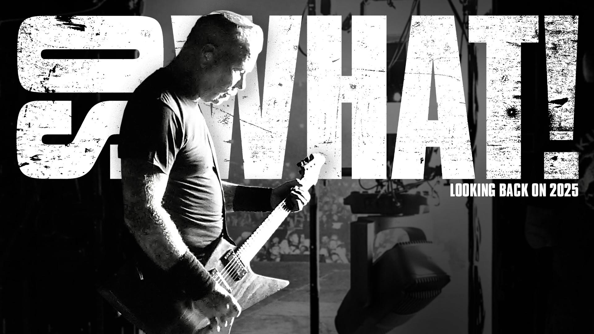
Deep in the heart of Ireland – County Wicklow to be precise, there was a boy. That boy would watch movies, and not just any movies, no. Jean-Claude Van Damme movies were of paramount intrigue to Colm Geoghegan, and it is for this reason alone that he had amassed so many illicit viewings of A.W.O.L (or Lionheart in the US) that the video store owner GAVE him the tape AND a head cleaner for the poor, beleaguered Geoghegan VHS machine.

“I was obviously ‘renting for my parents’,” he chuckles, “I’m sure they know about my Van Damme obsession at this point, even though I was sure I was watching secretly!” Growing up in the town of Blessington, a beautiful little town steeped in history and video shops, Colm would watch his artist father, Trevor Geoghegan, work. A skilled landscape and scene painter with a predilection for light, Trevor proved highly influential to Colm as he traversed the roads where music, film, and art intercede. A mixed-media artist, Colm’s work carries the same fascination and excitement at bringing shades of light to the pieces he produces, which have become increasingly dominated by reinventing movie posters. He describes doing the “Until It Sleeps” (coming Late Fall 2022) and “The Thing That Should Not Be” (coming Thursday, September 29) pieces as being ‘major bucket list items’ given that he is a huge fan of the band. In the following Zoom conversation, Colm explains how those pieces came to be, as well as discusses his love of horror and a certain breed of fowl…

Steffan Chirazi: So we’ve established how influential Trevor was to your path as an artist. What about your Mum, did she have any creative talents?

Colm Geoghegan: She did; she was a singer. So I got into music from her, and to this day, I still play. I used to play in a band, and I still (sort of) write and record my own stuff now. I’ve been playing for a while, hence the Jackson [Colm points to the guitar on the wall behind him].

SC: Ah, yes, I see that. I should also point out for the readers that just creeping into the frame is the edge of a The Shining Overlook Hotel patterned carpet. An iconic design. Let’s talk about film for a moment. Let’s talk about movie posters; I’m interested to know what movie posters caught your eye first as a kid.

CG: As a kid, The Towering Inferno was definitely one of them as well, with that giant fiery building and then all the little cast member pictures at the bottom. But the main one, and I’ll point it out on the wall behind me, was The Thing, done by Drew Struzan. He basically did E.T., Indiana Jones, those strong sort of sci-fi ones, and I thought they were all incredible. They really stimulated my curiosity, and I found the same things when I used to look at some album covers as well. I mightn’t have heard the music, but it made me curious, and it was the same with movies. So with posters like this, it became a case of, “How do I order the film and say it’s for my parents?!”

SC: Are you one of those people who, if you see a brilliant wine label, you’re like, “Ah, I might try that?”

CG: Yes! And the same with craft beer.

SC:  I’m the same, and I think that’s how art should be. It should capture you in that way. Give me a couple of album sleeves that captured you as a kid.

CG: Master of Puppets. Straight off the back, Master of Puppets. I was 11 or 12, and my friend in school came up to me; his brother was big into Metallica back then, and he said, “I’ve got a cassette of this band Metallica, and you have to listen to this!” I just looked at the cover and was taken. Back then, we’d copy the tape, and then we’d photocopy the cover, a little black and white copy, and make our own little cover for the bootleg tape. I’d sometimes customize them, make my own colors and stuff. I remember trying to copy the original Master… cover to see if I could do it as well, but I never could.

SC: Now I’d like to know a couple of posters that the films stood up to.


CG: The Thing, definitely. It’s a classic. Another one, actually a more recent one, was Mandy. I don’t know if you saw that. With Nicholas Cage?

SC: I didn’t see the film, but I actually remember the poster.

CG: It’s one of my favorite films. The best way to describe it is like a moving heavy metal cover, and also Die Hard. It was a very simple poster, but I just remember seeing half of Bruce Willis’s face and a big burning building on the other side of his face, and just said to me, “This looks really fun.” Then I watched it, and I was like, “Yeah, Die Hard’s amazing.”

SC: It’s a bit Towering Inferno, isn’t it?

CG: Yeah, and Die Hard was around the time where it became more photo composition sort of work as opposed to illustrative, and it was really badly done back then as well because nobody kinda knew how to do it properly.

SC: All of this is happening in your teenage years on a dual track between playing music, drawing, and maybe painting?

CG: Yeah. Actually, it used to go hand in hand because when I was playing in the band, Seven Days, we were called, and we’d record a demo, I used to do the covers for the demo. I played guitar, I sang, and I did the covers for the demo. Anyway, I went to college in Dublin, and I studied design. The course was called “Design and Presentation.” Back then, Photoshop would’ve just started, and I was on Quark for a long time.

SC: And then InDesign came and blew your world apart in a good way!

CG: It changed the world. Quark was very, very, very finicky, yeah. We also did photography, Photoshop, and mechanical drawing, which meant zero to me. I just couldn’t do it. I think because it was so rigid. There was a clinical feel to it, and I couldn’t freestyle anything. Everything had to be exact. I didn’t vibe with that at all. And then, after college, I got a job working for a magazine, so I did advertising design and editorial design for a long time. This was around 2001. I used to work for a bunch of different Irish magazines. So basically, in between that, on my weekends and stuff, I’d dabble in redoing film posters, and that’s how I kind of learned my chops that way. The day job was where I cut my teeth on design, and then as a hobby, I just used to do film posters. Gremlins was the first one I felt really good about.

SC: What are you looking to do when you’re like reinterpreting? Is it simply driven by an idea, or do you have a particular mission in mind?

CG: No, I’ll get a concept from just watching it, that’s if it’s a good movie. I found myself veering towards coming up with interesting concepts that collapse the plot and everything into one image. That was my thing, and I’ve carried that forward now. So with a lot of the stuff that I’m hired for, people will say they want singular images that encapsulate everything in the movie without just using people’s heads, that sort of thing.

SC: Give us a couple of examples of film posters that you really feel have captured that ethos.

CG: The one I did for Scream last year went viral, and then I was hired by Paramount from that, which was crazy! That was my first taste of working with a major studio, and it really snowballed from there. It can be quite surreal sometimes.


SC: Let’s talk a little bit about the pieces you’ve done. Given what you just said about overviews, they make a lot of sense, like “The Thing That Should Not Be.” That’s certainly a holistic overview of the song, and the poster is quite cinematic.

CG: When I listen to the song, I feel this big epic-ness to the whole thing. It just feels like a big stormy sea, you know? It’s got this ominous chug, it’s slow, and I love that kind of brooding. I picture a huge, big, open sea, which scares the shit out of me anyway because of fucking Jaws! So once I picture the open sea, it terrifies me because it’s just nothingness into nothingness. It’s like space. Space scares the crap out of me as well. I’ve never been there, though.

SC: Great thoughts, and yes, I’m with you on the open sea stuff. Meanwhile, “Until It Sleeps” looks like a dream explosion to me.

CG: There’s a bit of a Hieronymus Bosch feel, I think. It’s the surreal, dreamlike nature of it. So part of it was because I was always reminded of the video, great video. And then the other part reminded me of those really old Bosch paintings where you didn’t know what was happening, but you knew it was very dark.

SC: You can never go wrong when there’s a black goat and a raven somewhere in the frame…

CG: No. You can’t. I remember that something was to do with James’s relationship with his mother. And always, his kind of tug of war over religion, back and forth to my perception. So there’s a lot going on.

SC: If you don’t mind me asking, I don’t always do this actually, but I’d like to know how this cookie’s made, if you will. What do you start with, and how do you put it together? Honestly, to my eye, I can’t tell what’s computer, what’s hand, what’s photo. I can’t see the lines, and that’s a good thing, but I’d love to understand it on that technical level, so bring me through that if you would.

CG: It’s basically mixed media, so there are elements of photography, then there are elements of texture scans, most of which I do myself. And a little bit of Photoshop work in there for fog and stuff, so I do brushwork. Then it’s all thrown into a big pot and blended, hopefully seamlessly; otherwise I’m not very good at my job.

SC: Let me break this down for me, the simpleton. These layers. Do you have one layer with just the goat, do you have one layer with just the Statue of Liberty and one with the skeleton tree? Which parts are done by hand? Some of this looks to me like it has to have been hand drawn or hand colored, and I’m having a hard time figuring out exactly which bits.

CG: Let’s take the skeleton. The base of the skeleton was part of an image of a statue that I had taken, and stuff like the ribs, the hair, the crown, and the face were then all separate elements that were worked in together and blended in to make that ‘thing.’ Same with the flowers. So some of the flowers were initially a stock image of elements of maybe one stalk, and then they’re multiplied, and they’re overlaid with elements of grass, and then they’re blended in with, say, the skeleton. Same with the hands at the bottom. One of those hands is mine.

SC: Let’s let the readers guess which hand is yours, don’t tell them.

CG: Yeah, yeah.


SC: You can. We’ll see if anyone has a pitch at it. I’m going to assume that the scale that you’re working at is the scale of the screen that you’re working with?

CG: Yeah. So I work on a, it’s a 32-inch iMac, so it’s good size, which is what I need. So everything is done at that scale, and it makes it easier to make things a little bit more, I don’t know, vast or epic feeling when you’re working on a bigger scale, I think.

SC: How long did this piece, for example, take to put together? From first idea to final click of, “This is done.”

CG: About six hours.

SC: Six hours???

CG: Yeah. That’s my advertising and design background from deadline.

SC: You must have a treasure chest of elements at your disposal at all times. I imagine that your computer desktop must be like a physical studio in the sense of, “Okay, well, I need a raven from here, I need some flowers from here…” Do you sketch that concept out on a notepad, or do you just go straight to screen?

CG: Normally, I’ll do a rough outline because I can draw, and that could take anything from half an hour up to two hours, and that’s just deciding where I want everything and seeing if everything works together composition-wise. I’ll play with this until it clicks, and that part can take as long as a week for something to percolate.

SC: Have you had a set amount of ideas in your head for Metallica that you wanted to realize?

CG: Basically, yes! I had sketches all over the place, but then I needed to decide on two songs. And that was the hardest part for me, figuring out the ones that I could visualize into essentially a cinematic poster.

SC: Was there a third one that you wish you’d got the nod?

CG: Oh, that’s a tough one. It would be between two, “Fade to Black” or “…Sanitarium.”

SC: I’d like to know a little about your Dad’s medium. Oil? Watercolor?

CG: Oil, watercolor, acrylics, everything. I used to be in his home studio, sitting with him, drawing, getting tips, and stuff like that. And then when he had an exhibition myself and my sister always went along.

SC: And what sort of stuff were you drawing as a kid before discovering films?

CG: In secondary school, it was all band logos. That was my thing. And lots of skulls! My Dad used to teach as well, so he’d always have old sheep skulls for life drawings because they were perfect for all the contours, the shading, and the cracks. I have sketchbooks full of sheep skulls and similar stuff. And then the other thing was landscapes, which I think I got from my Dad because my Dad is more of a landscape artist, so he goes to places like Italy and Spain, takes loads of pictures, and then comes back and paints.

SC: So here’s that sneaky ‘final question’ with a plural ‘S.’ Pick a movie that you’d love to reimagine the poster for and an album cover that you’d like a crack at reinterpreting.

CG: Reinterpreting… Okay, for the album, I would say St. Anger. I like the overarching idea of St. Anger. And movie? I think I’ll go for Hellraiser. I’ve actually done Hellraiser posters, but I continue to keep doing them because it’s one of those incredibly dark and deep films, deeper than a lot of people give it credit for.

SC:…one more final question. Your design company is called Creepy Duck Design. Why?

CG: Because I like horror, obviously, but I also really like ducks! I do! They’re great! So Creepy Duck Design makes sense.

Give Colm a follow on Facebook, Twitter, and Instagram.